Moody, Dramatic, Gorgeous: The Case for Dark Interiors
October 2026
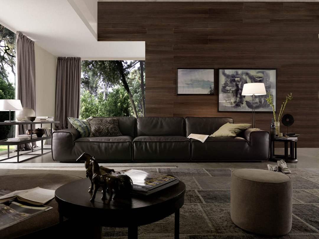
Dark interior design is the deliberate use of deep, saturated wall colors, rich upholstery and layered lighting to create rooms with depth, warmth and presence. Done well, a dark room does not feel small or closed in. It feels considered, enveloping and distinctly memorable.
How Do You Decorate With Dark Colors Without Making a Room Feel Small?
The idea that dark rooms shrink a space is one of the most persistent myths in design, and it rarely holds up once the work is actually done well. A room registers as small when dark color is applied flatly, with no variation in sheen or texture and no plan for how light will move through it. The fix is not to retreat to pale walls. It is to treat dark color as a foundation that other elements are layered against, the same discipline that makes any interior feel resolved rather than accidental.
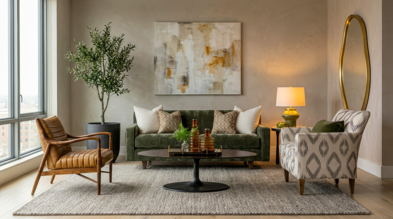
Dramatic living room design depends on contrast doing real work. A dark wall against light trim, a matte paint finish against a glossy lacquered surface, or a deep ceiling paired with reflective metal accents all keep the eye moving instead of letting the room go flat. Without that contrast, dark interior design collapses into a single dim mass. With it, the same square footage looks layered and alive.
Color alone is not what makes a dark room work. It is the discipline applied to everything that goes along with it. When done right, there is nothing else quite like it.
What Is Moody Interior Design?
At its core, moody home decor is a commitment to depth over brightness—rooms where deep wall tones, layered textiles and warm, purposeful lighting work in concert to create atmosphere rather than simply fill a space. It is less a single color choice than a philosophy: every material in the room is selected to hold its own against a dark backdrop, from upholstery weight to the finish on a piece of case goods. The goal is a space that feels composed at any hour, not only flattering in daylight.
What Paint Colors Are Used in Dark Luxury Interiors?
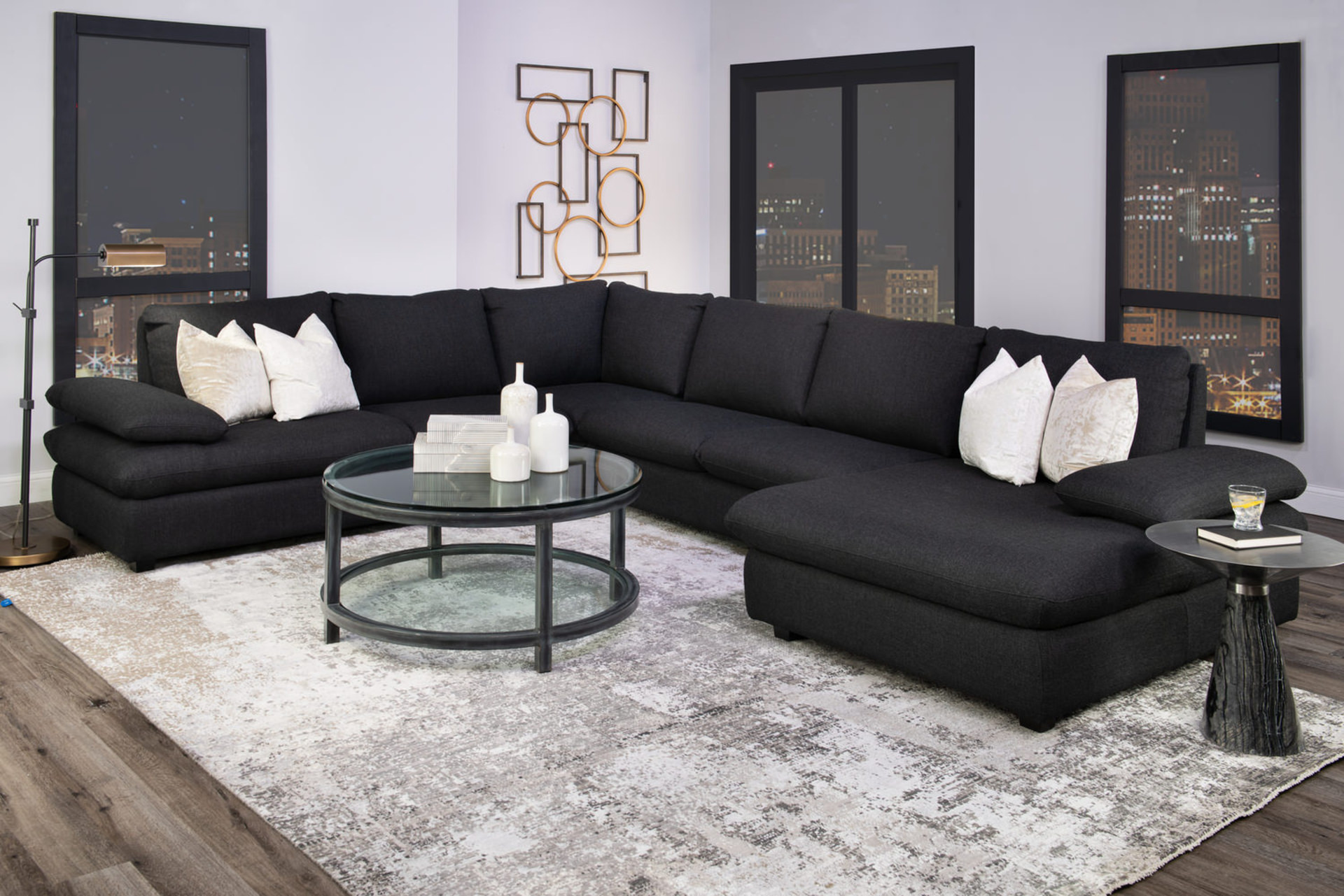
Color is the first and most consequential decision in deep color interiors, and the rooms that succeed almost always lean warm rather than cold. Charcoal, forest and deep olive greens, ink blues and warm espresso browns feel rich and inviting; true black and cool slate grays, used without care, can flatten a room and drain it of warmth. The most effective dark palettes pull from nature: bark, moss, oxblood, midnight blue. These families carry enough undertone to shift with the light throughout the day rather than sitting static on the wall.
Luxury dark rooms also tend to extend color beyond the walls. Trim, ceiling and millwork painted in the same family as the walls remove the visual stop points that make a room feel boxed in, allowing the eye to travel rather than catch on contrast. A room painted floor to ceiling in one deep tone, with no break at the crown, feels larger and more confident than the same room with white trim interrupting it.
Paint finish deserves the same care as color family. A flat or matte sheen absorbs light and gives dark walls a velvety, gallery-like quality; an eggshell or satin finish reflects it back, adding some movement and making the color appear to shift at different times of day. Choosing by default tends to produce results that feel slightly off without anyone being able to say why.
Why Material Choice Carries the Room
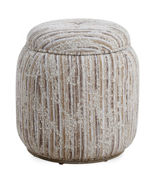
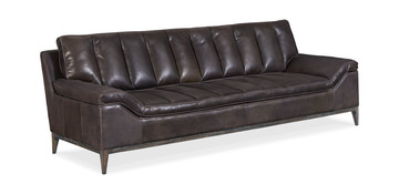
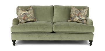
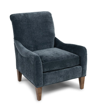
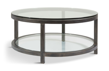
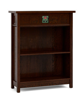
Dark walls raise the bar for everything placed against them. Flat, low-pile fabrics and thin veneers tend to disappear into a deep backdrop, while rich upholstery, dark wood and metal accents hold their own and give the room its sense of weight. A velvet or bouclé sofa, a leather chair with visible grain, a coffee table in walnut or ebonized oak: each brings a material presence that holds even in low light. Metal finishes earn their place here too. Aged brass, bronze and blackened steel catch light in a way that flat paint cannot, and a single well-placed metal accent does more to animate a dark room than an additional lamp.
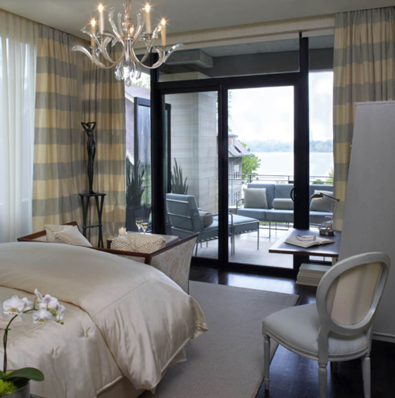
Window treatments belong in the same conversation. Floor-length drapery in velvet, linen or a textured weave adds vertical mass and softens the transition between wall and window—a critical detail in dark rooms, where an uncovered window at night becomes a black mirror that competes with everything around it. Hanging panels high and wide also strengthens the sense of architectural scale that dark rooms depend on.
How Do You Use Lighting in a Dark Room?
Layered lighting is not optional in dark interior design. It is the mechanism that makes the color work. A single overhead fixture in a dark room produces a flat pool of light surrounded by shadow, which is exactly the effect that makes a space feel small. The fix is height variation: floor lamps and table lamps at seated eye level, sconces at a middle height, and accent lighting on art or shelving above that. Warm bulbs keep deep colors from going cold or muddy after dark.
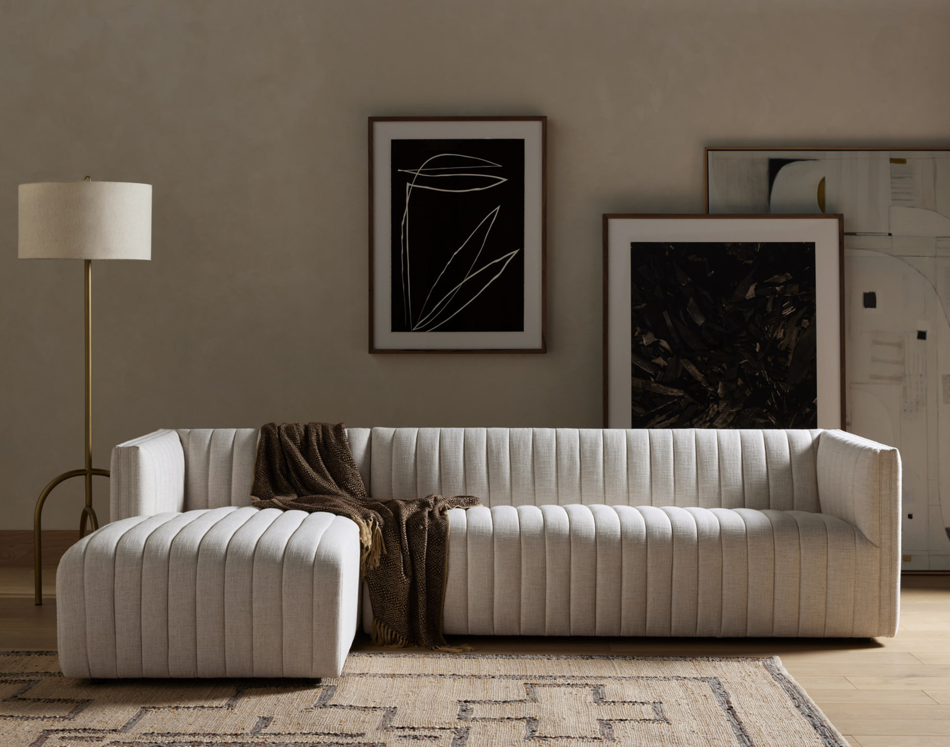
Dimmer switches matter here as well. A dark room pushed to full brightness quickly loses its atmosphere; brought down to sixty or seventy percent, it holds warmth and allows each light source to contribute on its own terms. Building that flexibility into the plan from the start—rather than treating it as an afterthought—is what distinguishes a dark room that performs at any hour from one that only works under ideal conditions.
Common dark room mistakes to avoid:
- One light source: relying on a single overhead fixture instead of layering light at multiple heights.
- Cool undertones: choosing a blue-black or cool gray that drains warmth from the room rather than adding it.
- Flat materials: pairing dark walls with thin fabrics and low-sheen finishes that disappear instead of reading as rich.
- Broken trim: painting walls dark but leaving white trim and ceiling, which interrupts the room and makes it feel boxed in.
The rooms that make the strongest case for dark interior design tend to share a common thread: nothing in them was left to chance. Color, material and light were chosen to work together rather than in isolation, which is the same disciplined approach a Gabberts designer brings to any space, dark or otherwise. For anyone drawn to this kind of drama but uncertain where to begin, that conversation is worth having before the first paint sample goes on the wall.