Paint Manufacturers Name their 2023 Colors of the Year
December 2022
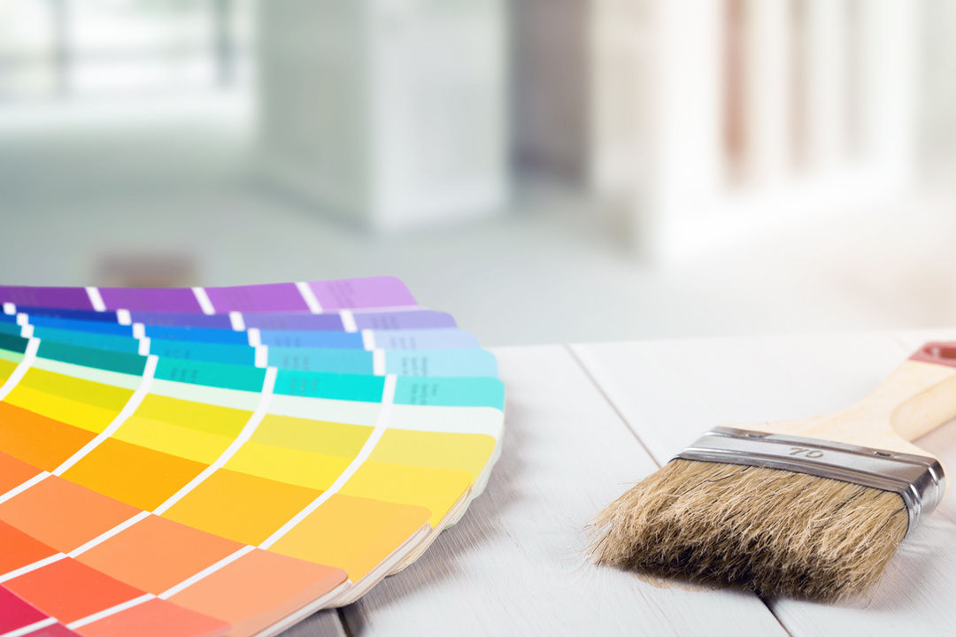
In keeping with the “Out with the old, in with the new!” expression that pops up every year as the ball drops in Times Square, paint manufacturers rush to predict their “it” colors for the upcoming year. Some of the biggest names in paint have already named their choice this year. Meet the winners from some of the biggest names, this year’s shades-to-beat!
· Raspberry Blush by Benjamin Moore
· Redend Point by Sherwin Williams
· Blank Canvas by Behr
A Nod to the Blue-Greens of 2022
In knowing where one is going, it’s helpful to know where one’s been! Last year’s colors of the year were primarily in the cool spectrum, with nature-inspired blue-green hues hitting most of the top spots. There was October Mist by Benjamin Moore, Evergreen Fog by Sherwin Williams, Guacamole by Glidden, and Breezeway by Behr to name a blue-green handful.
Things are Warming Up in 2023
While the favorite hues of 2022 were mostly cool colors, things are warming up for 2023. The colors of the year are falling mostly on the warm end of the color spectrum—either in bright warm colors or neutrals with warm undertones. The inspiration? There are several. Many people are looking for cheery, optimism in their color tones, and warm tones can set a backdrop for cozy and inviting spaces. While this year’s shades have more reds and oranges in them, they share some common ground with last year’s winners. Earthy and natural tones are still trending, with odes to Mother Nature on our walls, as well as the furniture and decor throughout our home interiors.
Get to Know the Winners
You’ll be seeing these shades all year—not just on walls, but in furnishings and décor as well. It’s time to get to know them, the effect these colors can have in a room, and ideas on how to incorporate your favorite shades into your space.
Raspberry Blush by Benjamin Moore
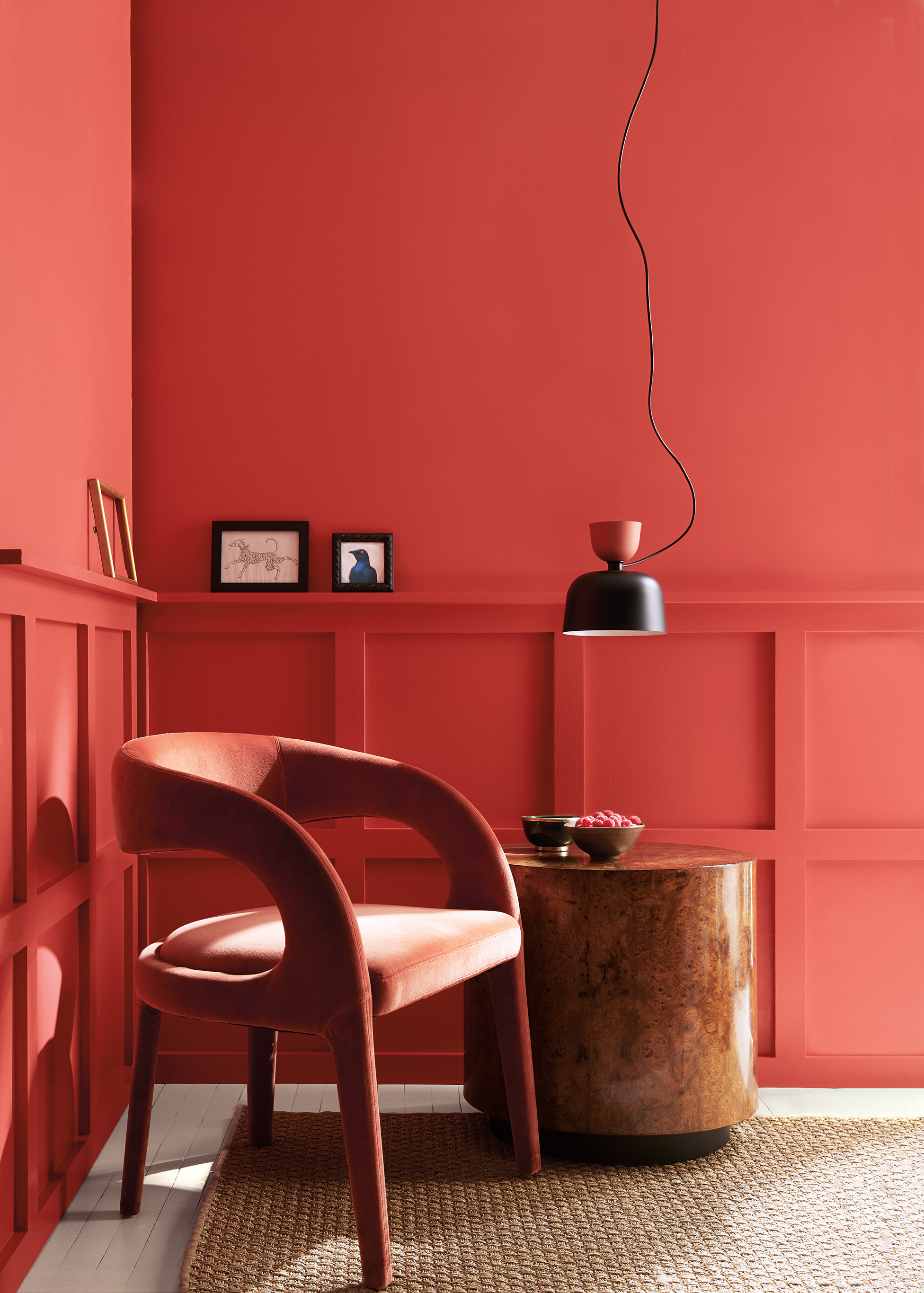
Raspberry Blush 2008-30 is a saturated red-orange color that is warm, bright and energizing. It’s a bold shade that is intended to move away from the neutral, cool and gray tones that have been popular in recent years, and add a lively “wow factor” to the room.
“People are ready to bring color back into the home, taking a step outside their color comfort zones,” said Andrea Magno, Color Marketing & Development Director at Benjamin Moore. “Raspberry Blush 2008-30 and the Color Trends 2023 palette empower the use of statement colors that deliver delight and personality, while transforming rooms for incredible results.”
Raspberry Blush is a bold color, but it can also be versatile. You can use it to paint the walls in an entire room or simply bring in little pops of color. Here are some ideas to go a little (or a lot!) bold with Raspberry Blush:
- Update outmoded red dining room walls from the early 2000s with this “it” shade.
- Opt for a statement ceiling instead of an accent wall and hit two trends in one this year.
- Add raspberry blush to your walls in a less-permanent mode by opting for artwork featuring the shade.
- Balance the Raspberry Blush accents in your room by choosing a new area rug that features the same color.
- Update your neutral sofa with Raspberry Blush accent pillows and/or a throw blanket.
- Bring a stunning upgrade to your master by painting the ensuite with the red-orange shade.
Another reason to love Raspberry Blush? It plays well with others. The company picked a Color Trends 2023 palette with eight distinct hues to serve as inspiration for the year. These colors include shades like cinnamon that can give you a striking, monochromatic look with a little bit of variety, as well as a blue and green shade that make pleasant complementary companions. The Color Trends palette includes: Conch Shell, Cinnamon, Wenge, Savannah Green, New Age, Starry Night Blue and North Sea Green.
Additionally, they suggest a set of neutral colors with warm, cool and neutral undertones to pair with the colors of your choice: Etiquette, White Heron, Gray Owl and Onyx.
Redend Point by Sherwin Williams
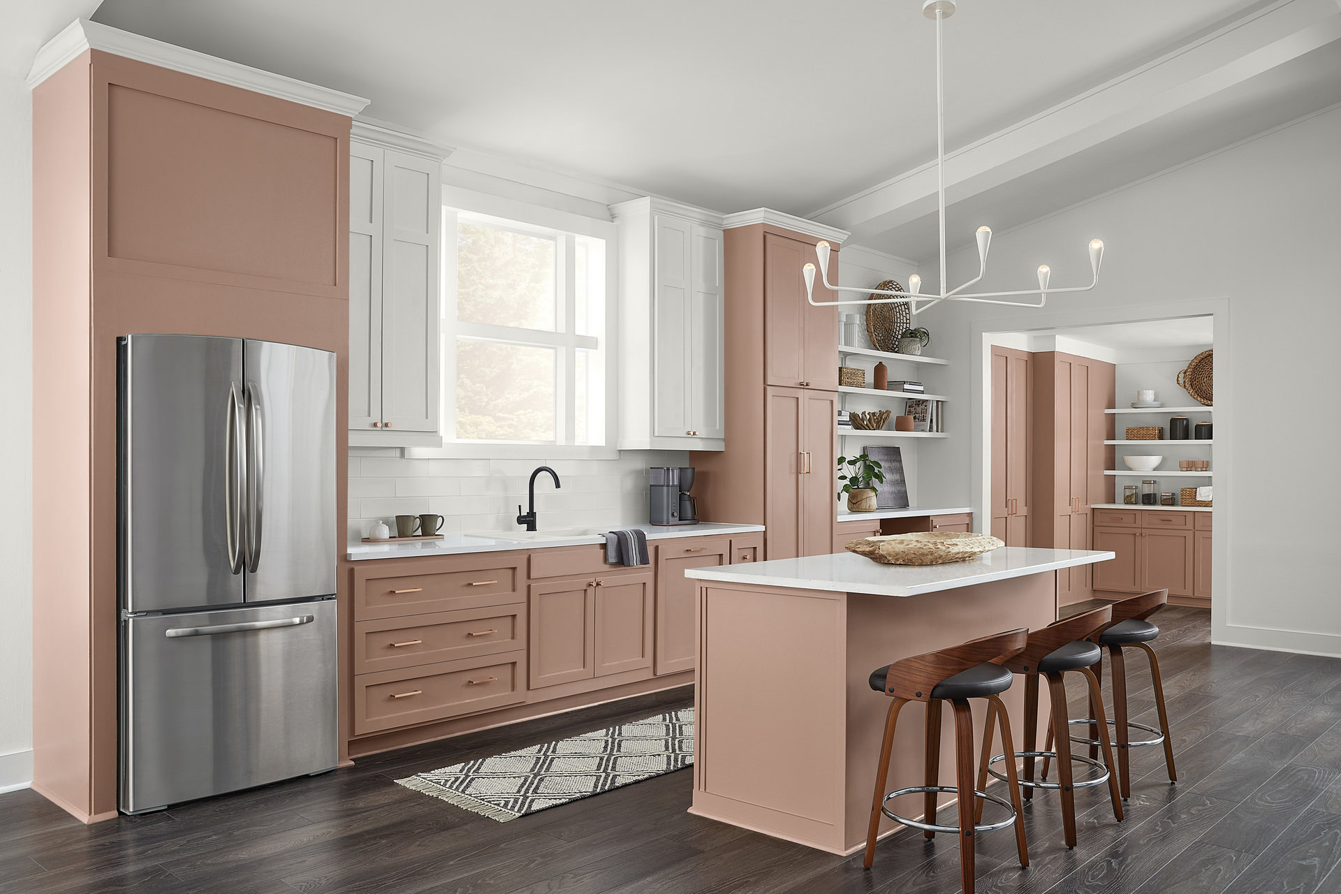
It’s a beige-like neutral with subtle and surprising blush overtones, and it blends well with a mix of shades, especially those that evoke nature. Redend Point was designed to encourage rest and relaxation. It’s inspired by the natural world where health and wellness are key. We already see tinted variations of beige online in meditation and mental health apps, and it’s a logical next step to extend those benefits to our living spaces.
White and eggshell are popular choices for wall colors, but Redend Point has a welcoming coziness that those more traditional standbys can’t match. It’s just as familiar and reassuring while offering an extra measure of grounding and nurture.
"Redend Point was inspired by the idea of finding beauty beyond ourselves. It is a heartening hue that invites compassion and connection into any space," said Sue Wadden, director of color marketing at Sherwin-Williams. "The color is a natural choice for those looking for a warm and joyful neutral in both interiors and exteriors. Redend Point is a beautiful color and I can't wait to see how consumers play with it and style their spaces."
Redend Point is a versatile color, and it accommodates a wide range of interior design color schemes. Here are some ideas of how to incorporate the color into your home:
- Pair Redend Point with browns and creams for a warm and welcoming living room. For instance, you can paint walls with Redend Point, add a cream sofa and chairs along with some darker wooden accents.
- Update your kitchen with a coat of paint and team up with dark brown barstools or chairs and a lighter countertop.
- Refresh your dining room. The color handsomely sets off a two-toned brown and cream dining set.
- Play off the natural feel of the shade by pairing it with organic materials such as wicker, whether in a chair or just in the form of a basket on a shelf. Textiles, stone and vintage-inspired accessories all can work well in a room this hue.
- Add more assertive colors to garner a little extra pizzazz with Redend Point in the background. Think greens, either bright or gentle, along with multiple shades of blue and even rich reds.
- Style this neutral with floral patterns for a farmhouse ambiance.
Blank Canvas by Behr
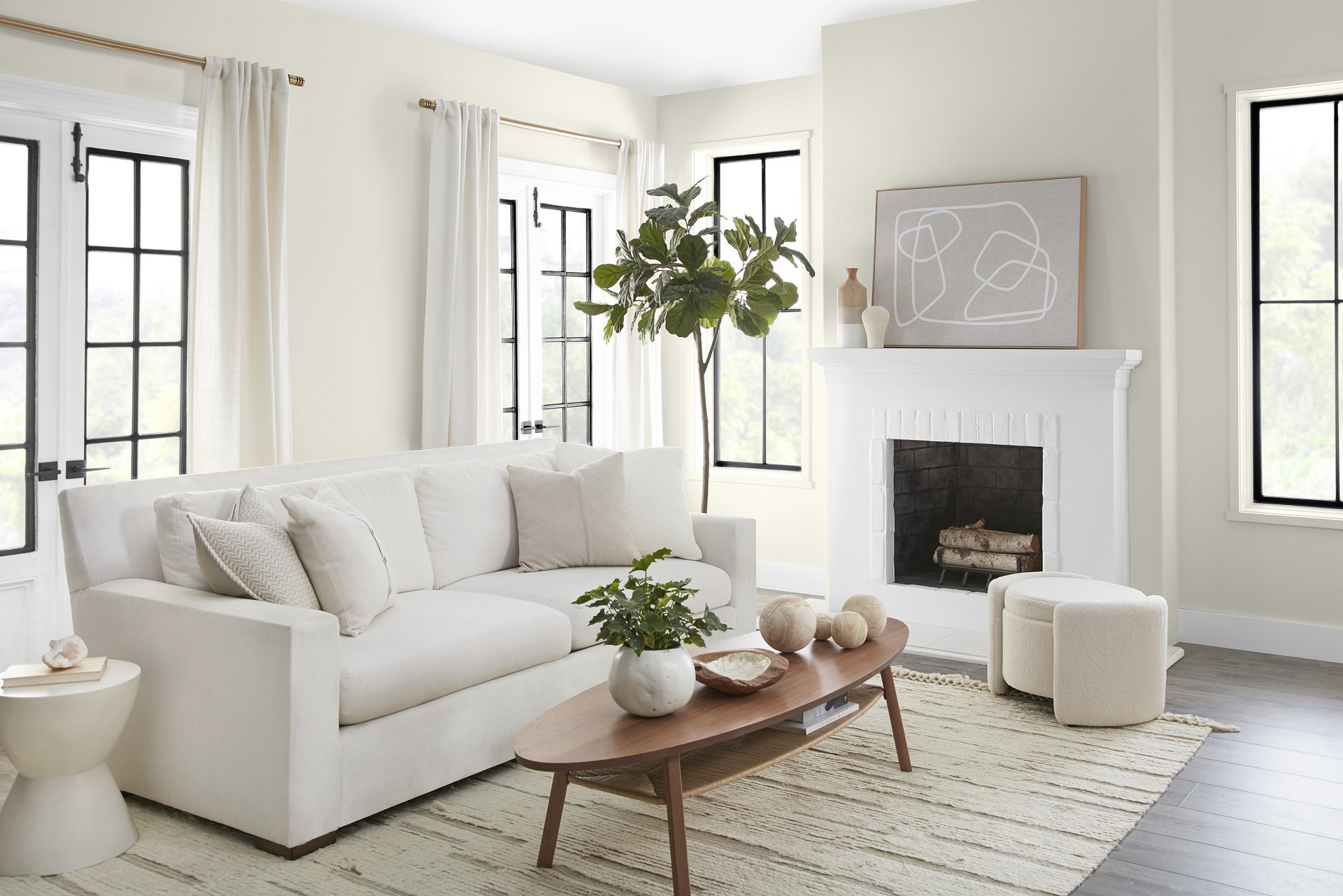
Behr’s 2023 Color of the Year is Blank Canvas DC-003, a warm white shade. While it’s a familiar and perhaps safe bet for the color-hesitant, it leans warmer than the white and gray neutrals that have been so popular in the past decade. It’s a fresh start that is ideal for refreshing your space!
"As we look to 2023, we understand that comfort will still be a driving force behind design decisions and style statements," says Erika Woelfel, Vice President of Color and Creative Services at Behr Paint Company. "Blank Canvas effortlessly offers a clean and inviting blank slate that allows individuality and creativity to flow freely. This white easily harmonizes with a wide range of hues, including neutrals, earth tones and pastels for a charming and cozy appeal. Blank Canvas also pairs beautifully with black for a dramatic impact, and with bright accents like green or cobalt blue to instantly lift your mood."
This versatile neutral can help refresh any space in your home, such as:
- Set a welcoming tone for entries, foyers and mudrooms by painting all the walls with Blank Canvas.
- Designate a neutral background for your living space that can balance out your favorite bright colors while also helping them “pop”; or pair it with other neutrals that create a clean slate and let textures take the main stage.
- Create a clean and versatile backdrop for your kitchen and dining space.
- Add a calming neutral to your bedroom to create a beautiful oasis that can be enhanced with layered neutrals, rich textures and pops of calming blue and green shades.
- Bring a spa-like feel to your bathroom that’s clean, minimal and yet warm.
Behr color experts have recommendations for colors to pair with blank canvas, including:
- Vine Leaf
- Vintage Pewter
- Midnight Blue
- Gratifying Gray
- Cracked Pepper
While these suggestions can give you some direction, the shining quality of Blank Canvas is that is can essentially be paired with any of your favorite colors, enhanced with different textures, and brought to life with the addition of any of your favorite textures to the space. The warm undertones make it look great with rich wood tones in your furnishings, and earthy and organic textures will suit the color and create an on-trend look in your space.
Whether you choose one of these colors or your own favorite hue, colors can have a huge impact on your space. There are many ways to try out a new color through décor and accent furniture, or you can dive right into the color well and break out the paint cans!
