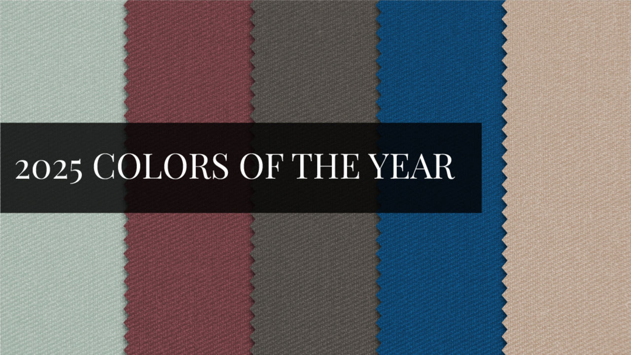
2025 Colors of the Year
November 2024
Incorporating the 2025 Colors of the Year into Your Home
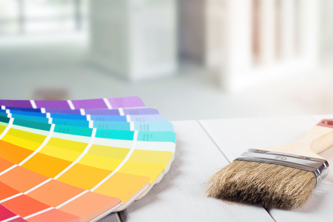
As we move into 2025, the world of interior design is buzzing with excitement about the new Color of the Year selections from some of the most reputable paint brands and other industry leaders. These colors are more than just trends; they are reflections of our collective mood, aspirations, and the way we wish to shape our living spaces. Whether you're looking to refresh a single room or undertake a complete home makeover, integrating these hues into your décor can bring a sense of renewal and style. Join us as we explore upcoming interior design color schemes for 2025 and how they can rejuvenate your home.
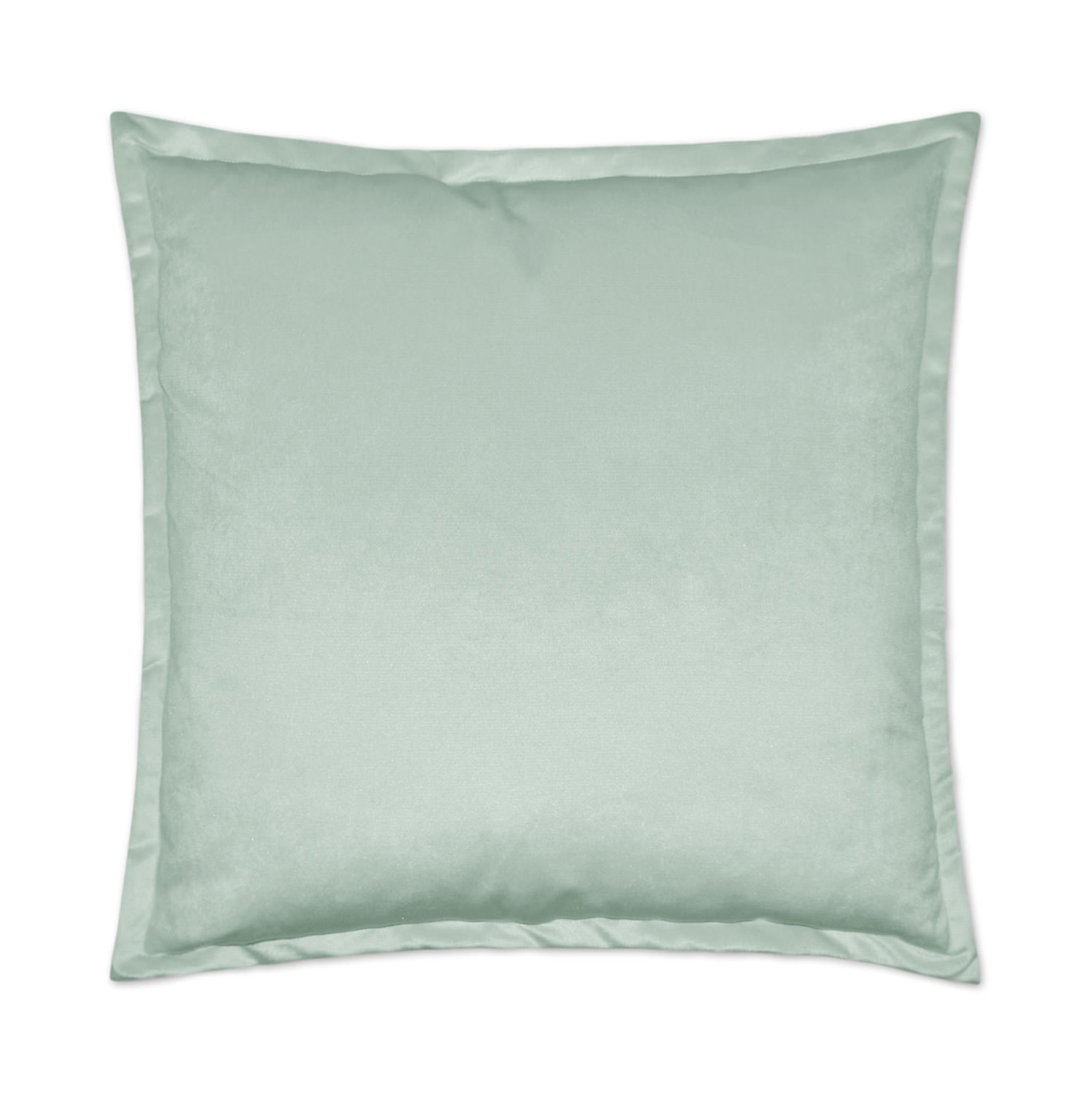
Quietude by Sherwin-Williams
Why Quietude? HGTV Home by Sherwin-Williams selected Quietude HGSW6212 as one of its key colors for 2025, drawing inspiration from the global desire for tranquility and mindfulness. After years of rapid change and uncertainty, this soft, muted green-blue offers a sense of calm and balance. It's a versatile color that can work in various settings, from bedrooms to living rooms, and even in home offices where a serene atmosphere is essential.
What Quietude Inspires Quietude is designed to evoke a sense of peace and rejuvenation. It connects us to nature, promoting a feeling of well-being and mental clarity. This color is perfect for those looking to create a sanctuary within their home, a place where they can unwind and recharge.
Complimentary Colors
Soft Whites: To enhance the calming effect, pair Quietude with soft whites like Alabaster or Pure White.
Warm Grays: Consider warm gray tones like Repose Gray to add depth and sophistication.
Natural Wood Tones: Quietude works beautifully with natural wood finishes, emphasizing the organic feel of the space.
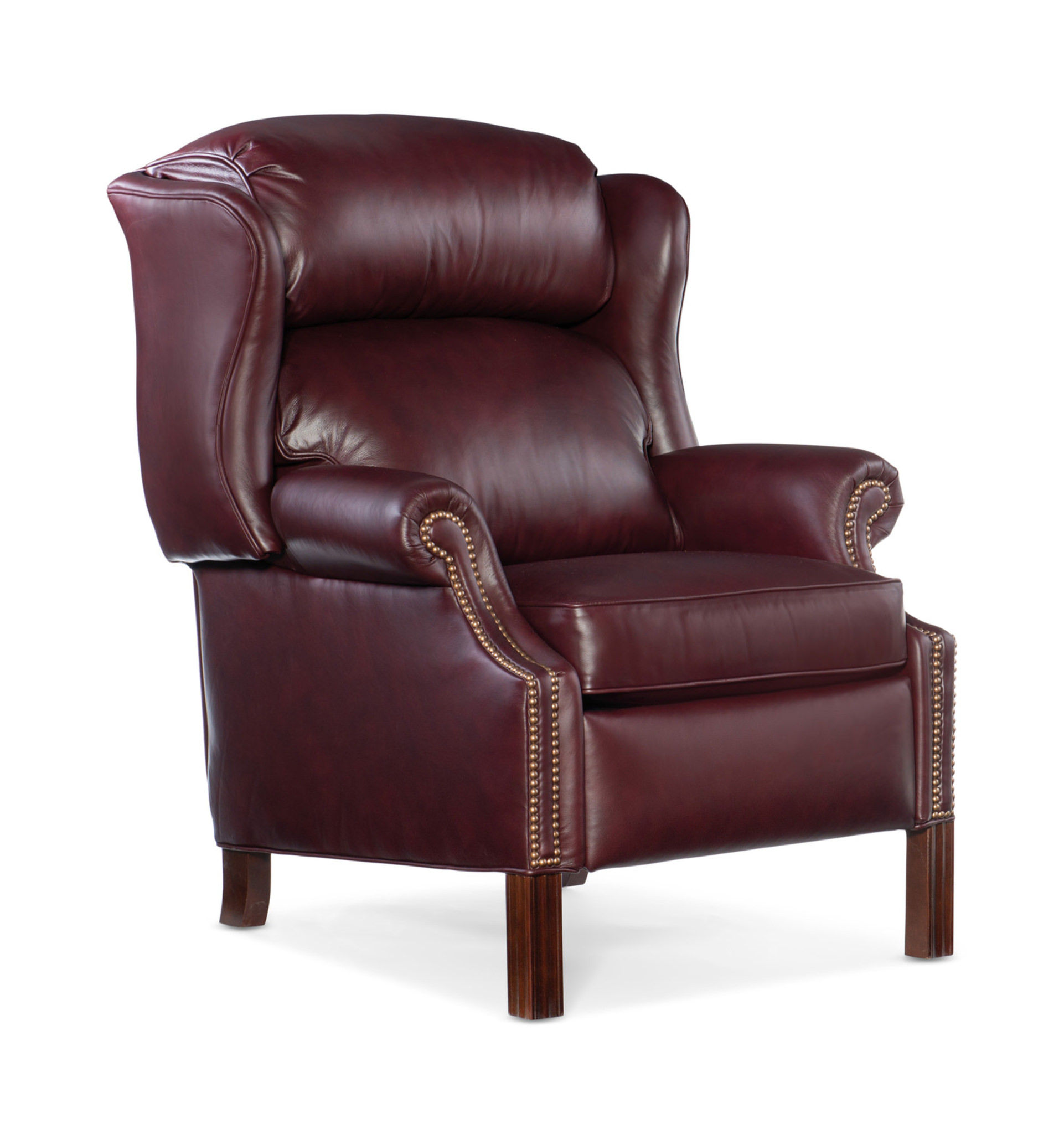
Rumors by BEHR
Why Rumors? BEHR's choice of Rumors for 2025 is rooted in the idea of embracing warmth and rich allure. “Rumors is a modern take on the timeless red that creates an energetic appeal to make a lasting statement in a stunning way,” said Erika Woelfel, Vice President of Color and Creative Services at Behr Paint Company. Rumors is a ruby-red color that makes a statement, perfect for those who aren't afraid to experiment with bold colors and creative design choices.
What Rumors Inspires Rumors inspires a sense of passion and elegance. It is ideal for spaces where you want to create a dramatic impact, such as dining rooms, entryways, or feature walls. This color can also serve as a backdrop for eclectic art and furnishings, allowing your personal style to shine.
Complimentary Colors
Warm Whites: Use warm whites, such as Blank Canvas, to offset bold colors like Rumors to create contrast and make the ruby pop.
Light Blues: Complementary colors, like warm Aerial View, provide depth and artistic expression.
Black tones: Include black accent furniture, artwork, or doors to ground Rumors’ rich tones and create an aura of luxury.
Truffle by STAINMASTER
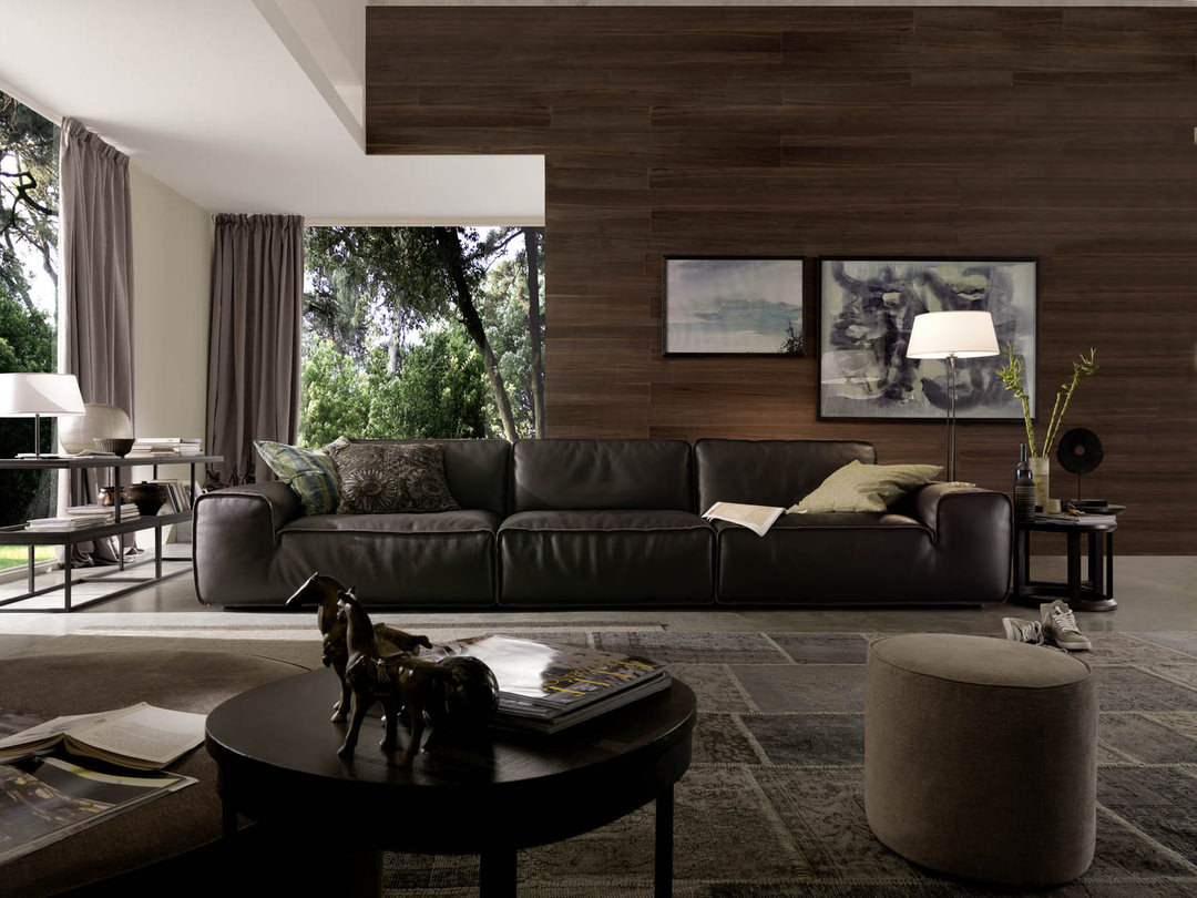
Why Truffle? STAINMASTER's Truffle is a warm, earthy brown that brings comfort and warmth into any space. The choice of Truffle for 2025 reflects a shift towards cozy, grounding colors that make a home feel inviting and secure. It's a color that speaks to our desire for connection and stability, particularly in communal spaces like living rooms and kitchens. Truffle is a versatile carpet and flooring color that can suit any design aesthetic - from traditional to trendy. An interior designer can also bring the same warm color in through a variety of home furnishings and accent pieces.
What Truffle Inspires Truffle inspires a sense of coziness and togetherness. It's a color that makes a room feel like a comforting embrace, perfect for gathering spaces where you want to foster intimacy and warmth. Whether used on flooring, walls, furniture, or accessories, Truffle adds a touch of natural beauty to any room.
Complimentary Colors
Creamy Neutrals: Combine Truffle with creamy neutrals like Beige or Ecru to maintain a warm, harmonious palette.
Soft Greens: Soft green shades like Sage can enhance the organic feel of Truffle, creating a serene environment.
Deep Reds: For a more dramatic effect, pair Truffle with deep reds or burgundies.
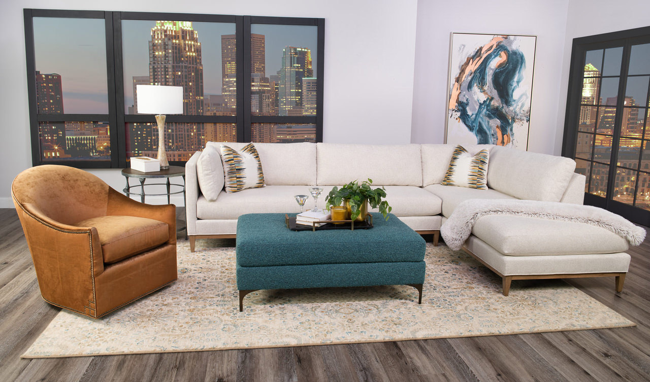
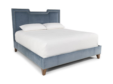
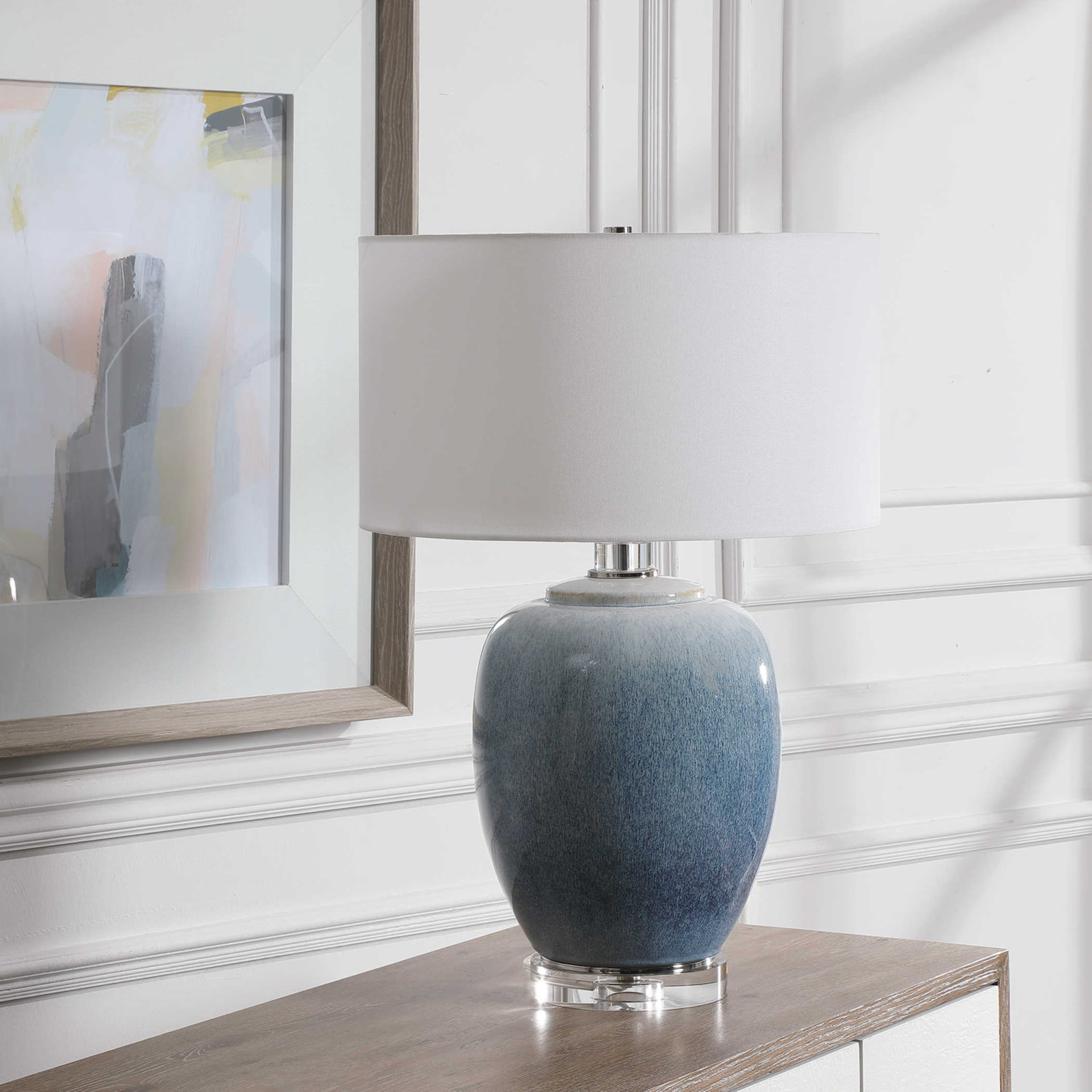
Encore by Valspar
Why Encore? Valspar's Encore 8002-45G is a deep, vibrant blue that embodies the energy and creativity of 2025. This color was chosen for its versatility and confidence,making it perfect for spaces where you want to encourage positivity and joy. Encore is a bold choice that reflects a forward-looking attitude while embracing old world elegance.
What Encore Inspires Encore is all about joy and imagination. It's a color that sparks creativity and can be used to inject life into any room. Whether in a home office, kitchen, or children's room, Encore brings a sense of fun and vibrancy that can transform the space into an inspiring environment.
Complimentary Colors
Cool Grays: Pair Encore with cool grays like Silver Dust to balance its brightness and add sophistication.
Muted Greens: Cool gray greens, like Sprig of Sage, bring in an organic, natural feel. Bright whites can amplify the energy of Encore while keeping the overall look fresh.
Golds: Adorn Encore with metallic accents in muted golds and brass for an unexpected touch of elegance.
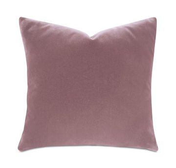
Mochi by Little Greene
Why Mochi? Mochi by Little Greene is a soft, muted pink that was chosen for its calming and nurturing qualities. Mochi offers a plaster-like, warm, neutral backdrop for nearly any room of the home. This color is ideal for creating spaces that feel like a retreat, where you can relax and escape from the stresses of daily life.
What Mochi Inspires Mochi inspires a sense of comfort and tenderness. It's a color that can make any room feel more inviting and warm. Mochi is perfect for bedrooms, nurseries, or any space where you want to create a serene, comforting atmosphere.
Complimentary Colors
Warm Neutrals: Pair Mochi with warm neutrals like Taupe or Sand for a soft, cohesive look.
Light Grays: Light grays like Dove Gray can add a touch of modernity while maintaining a calm, soothing vibe.
Gold Accents: Gold accents can add a touch of elegance and luxury to a room painted in Mochi.
Conclusion
Incorporating the 2025 Colors of the Year into your home is not just about staying on trend; it's about creating spaces that resonate with your personal style and the atmosphere you wish to cultivate. Whether you are drawn to the tranquility of Quietude, the intrigue of Rumors, the warmth of Truffle, the vibrancy of Encore, or the softness of Mochi, each of these colors offers something unique.
No matter which color speaks to you, remember that the key to successful interior design is creating a space that feels like home—a place where you can express yourself, find comfort, and thrive. Schedule a complimentary design consultation to collaborate with one of our interior designers in using your favorite colors to create a personalized color palette that will complement your home.